Dita Wide
Lettermin · Ermin Međedović · 2018
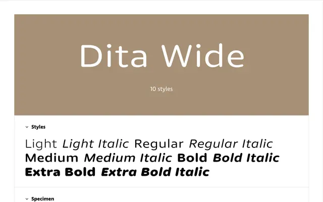
A wide-cut rounded sans serif with consistent low-contrast strokes, designed to work across both text and UI contexts.
About
Part of the 30-font Dita Collection alongside normal and condensed widths, the Wide cut spans five weights from Light to Extra Bold, each with a complementary italic and small caps. Rounded stroke terminals are maintained consistently across all weights, which required restraining the weight range to keep the rounding optically coherent. Figure variants include proportional and tabular lining and oldstyle figures, plus small-cap numerals, making the family well suited to editorial hierarchies and data-heavy layouts.
Classification
A low-contrast rounded sans serif with geometric terminals and consistent stroke weights, placing it squarely in the geometric sans category with a softer, contemporary inflection.