Dita Condensed
Lettermin · Ermin Međedović · 2018
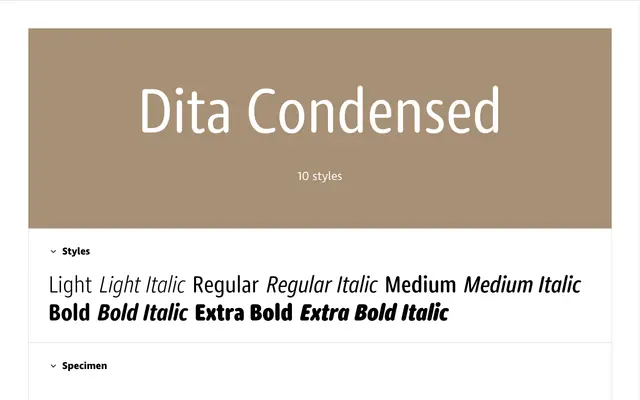
A condensed cut of Ermin Međedović's rounded geometric sans, offering five weights with italics and small caps across a generous 928-glyph character set.
About
Part of the 30-font Dita Collection alongside normal and wide widths, the Condensed family runs from Light to Extra Bold with matching italics in each weight. Rounded stroke terminals define the look, while a generous x-height and open counters keep lighter weights legible at text sizes and on screen. Numerals come in five variants covering proportional and tabular lining and oldstyle figures plus small-cap figures, making the family practical for editorial and data-heavy layouts.
Classification
A low-contrast sans with rounded stroke terminals and geometric underpinnings; the rounded endings and even stroke weight place it firmly in the geometric humanist camp rather than grotesque.