Refer
Lettermin · Ermin Međedović · 2024
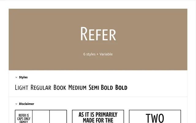
An all-capitals family originally designed for crossword puzzles, built around the diacritical demands of Slovenian and a duplexed structure that keeps line length fixed across weights.
About
Conceived for the constrained grid of crossword puzzles, Refer is composed entirely of capital letters engineered to occupy minimal vertical space while remaining legible. Diacritics are handled by lightening the upper portions of accented letters or, at tight line spacing, offering accented small caps whose total height never exceeds cap height. Three subfamilies address distinct print conditions: the plain Refer for clean digital and print use, Refer Print with ink traps for low-quality paper, and Refer Press with soft ink-flow irregularities that evoke traditional press printing.
Classification
An all-capitals typeface conceived specifically for crossword puzzles and tight-spaced print scenarios, with no true lowercase, placing it firmly in the display category with a functional, geometric sensibility.