Refer Press
Lettermin · Ermin Međedović · 2025
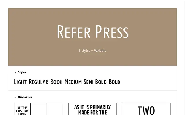
An all-caps subfamily of the Refer collection that mimics the ink flow irregularities and soft blur of traditional press printing, originally engineered for crossword puzzle grids and Slovenian diacritics.
About
Refer Press is the third member of the Refer family, following the clean Refer and the ink-trap-equipped Refer Print. It introduces subtle ink flow irregularities and a softened, blurred quality that recalls letterforms already impressed on the page, giving a warm, organic texture while retaining the all-caps, space-conscious structure of its siblings. The duplexed design ensures weight changes do not alter line length, and accented small caps keep diacritics within cap height for tightly spaced settings. Available in six static weights and as a variable font.
Classification
An all-caps typeface with simulated press-printing irregularities, designed for spatial economy in crossword grids and tight editorial contexts. Its display orientation and deliberate textural distress place it firmly outside conventional text or sans-serif categories.