Refer Print
Lettermin · Ermin Međedović · 2024
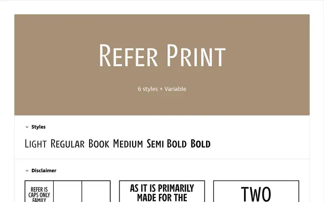
An all-capitals family with ink traps, originally designed for crossword puzzles in Slovenian, engineered to hold sharp at small sizes on low-quality paper.
About
Refer Print is the ink-trap variant within the three-subfamily Refer collection, built for newspapers and other challenging print conditions where ink spread would otherwise compromise legibility. Every letterform is capitals-only, with accented characters handled by two strategies: lighter upper strokes on top-accented letters to reduce visual weight, and accented small caps that never exceed cap height for tight line spacing. The family uses a duplexed structure so weight changes do not alter line length, and all six static styles are matched by a variable font.
Classification
An all-capitals display family with ink traps engineered for demanding print conditions, conceived originally for crossword puzzles and space-constrained layouts. Its purpose-built, single-case design places it firmly in the display category rather than a conventional text serif or sans-serif.