Borges
Pampatype · Alejandro Lo Celso · 2004
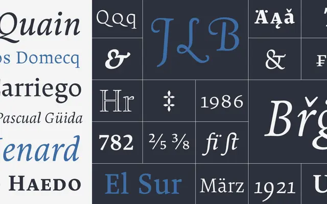
A text serif by Alejandro Lo Celso drawing on French Renaissance garalde tradition inflected with Dutch 20th-century proportions, designed for long-form reading in books and magazines.
About
Designed as a tribute to Jorge Luis Borges, the family takes its cue from his exacting prose style: clean, economical letterforms with round, open counters that build rhythm across a page of text. Six weights run from ExtraLight to Black, each with a matching italic and small caps; the italic is notably fluid. Display companions — Borges Open, Borges Poema and Borges Titling — extend the family for titling and chancery uses. Borges Título Hueca was awarded a prize by Matthew Carter at the Morisawa Awards in Tokyo, 2002.
Classification
Combines French Renaissance garalde proportions with Dutch 20th-century influence: tall, slightly condensed lowercase with stroke contrast slightly above a classic garalde. Pampatype themselves tag it as garalde, old-style and transitional.