No. 3 Series
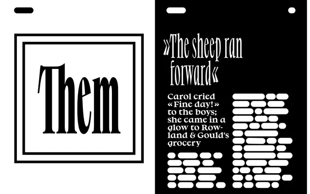
A humanist serif family in three widths, developed by revisiting the Renaissance shift from pen-written letters to movable type, with lowercase forms derived from the rotation of broad-nib italic strokes.
About
The family spans four weights across three distinct widths — Normal, Narrow and Poster — making it suitable for titling, identities, books, magazines and screen use. Its lowercase a, d, p and q are built on the theoretical strokes of italic handwriting with the slope removed, preserving the pen's underlying geometry in upright forms. The result sits between calligraphic tradition and speculative type history, imagining how Renaissance punchcutters might have deviated from convention.
Classification
The typeface is explicitly described as having the characteristics of humanist letters and is rooted in the Renaissance transition from pen-based writing to movable type, with forms derived from the rotation of broad-nib italic strokes — firmly placing it in the humanist serif tradition.