No. 3 Series Poster
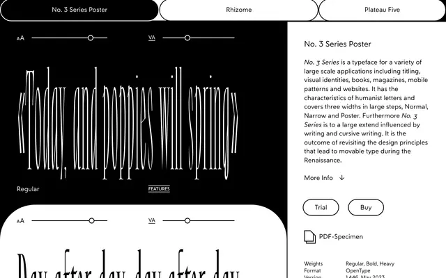
A wide display cut of No. 3 Series, built from a study of Renaissance type-cutting and the transition from broad-nib writing to movable type.
About
No. 3 Series Poster is the widest member of a three-width family, alongside Normal and Narrow, designed for titling, identities and large-scale applications. Its lowercase construction follows the principle of rotating italic letters written with a broad nib pen, reducing the slope to vertical while preserving the underlying stroke logic. The result sits between historical revival and speculative interpretation, imagining alternative paths from Renaissance handwriting into type.
Classification
The typeface draws explicitly on Renaissance movable type principles and humanist letterforms, with strong calligraphic and cursive writing influences informing the construction of its lowercase characters.