No. 3 Series Narrow
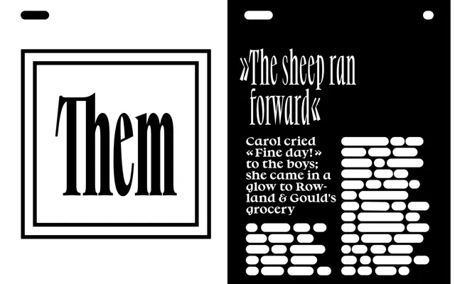
A narrow-width cut of a humanist serif family rooted in Renaissance pen-writing logic, tracing how early type designers adapted handwriting habits into movable type.
About
No. 3 Series Narrow is the condensed variant of a three-width family designed around the transition from broad-nib cursive writing to Renaissance movable type. The lowercase a, d, p and q are constructed from the theoretical rotational strokes of italic calligraphy, with the slope removed but the underlying structure preserved. Available in Regular, Bold and Heavy, it is suited to titling, visual identities, editorial work and screen applications.
Classification
Described explicitly as having humanist letter characteristics, with forms derived from Renaissance movable type and the rotational logic of italic broad-nib pen strokes, placing it firmly in the humanist serif tradition.