Arnhem Display
TYPE BY · Fred Smeijers · 2006
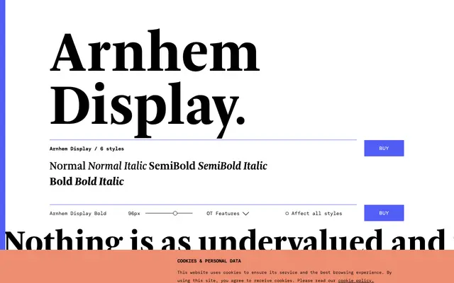
A display-optimised serif by Fred Smeijers, developed for Het Financieele Dagblad and rooted in the Arnhem family originally drawn for the Dutch government newspaper.
About
Designed in 2006 for the redesign of Het Financieele Dagblad, this display cut of Arnhem sharpens the original text family's details for headline use, with gracefully tailored italics and crisp contrast across three weights. The original Arnhem was drawn by Fred Smeijers in 1999 for the Nederlandse Staatscourant, giving the family a grounding in serious Dutch editorial practice. OpenType features include oldstyle and lining figures in both tabular and proportional widths, fractions, case-sensitive punctuation and a full range of accented characters for Western, Central and Eastern European Latin languages.
Classification
Arnhem Display is a transitional serif with roots in traditional typography, originally developed for newspaper headline composition with crisp, high-contrast letterforms suited to large-size editorial use.