Gustella Solid
TYPE BY · Thomas Thiemich · 2019
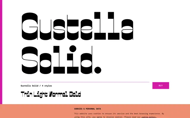
An extreme reverse-contrast display typeface in four weights, part of Thomas Thiemich's Gustella superfamily released by TYPE BY in 2019.
About
Drawing on nineteenth-century poster slab serifs and the high-contrast lettering of hippy-culture graphics, Gustella Solid pushes reverse-contrast to a contemporary extreme with digital precision. The four weights from Thin to Bold share identical metrics with the Stripes, Inline and Boxed variants of the superfamily, allowing the separate cuts to be layered or overprinted for compound effects. An extensive OpenType feature set covers stylistic alternates, multiple figure styles, fractions, case-sensitive punctuation and full Latin coverage across Western, Central and Eastern European languages.
Classification
Gustella Solid belongs firmly in the display category as an extreme reverse-contrast design drawing on nineteenth-century slab serif 'WANTED' poster lettering and the high-contrast lettering of 1970s counterculture graphics. Its exaggerated stroke contrast, inverted from conventional tradition, marks it as a specialist display face rather than a usable text type.