Hurme FIN 1a
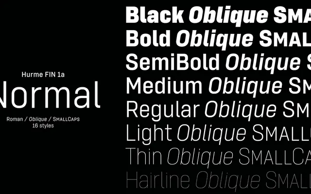
A monolinear grotesque with nine widths and eight weights, forming part of a larger system that includes slab and monospaced variants.
About
Built on a simplified monolinear structure with horizontal stroke terminals and short ascenders and descenders, Hurme FIN 1a spans 144 styles across eight weights and nine widths from Compressed to Expanded. Optically adjusted obliques accompany every weight, and the x-height scales proportionally in narrower widths to preserve legibility. Purchasing FIN 1a includes corresponding weights of FIN 1b, an angular alternative featuring slab-serif accents and monospace-influenced characters accessible via OpenType features.
Classification
A simplified monolinear sans-serif with horizontal stroke terminals, placing it firmly in the grotesque tradition. The family's range of widths and weights, alongside an alternative slab-accented variant (FIN 1b), reinforces its utility-driven, neutral grotesque character.